tinder
boost stats
2024
design strategy
product design
design systems
visual design
branding
about✐
While the overall adoption of Boost products has gone up, Boost revenue is down by 1.6%. While we might have optimized the entry points for Boost products, the perceived or actual effectiveness of the product can be further optimized.
Users do not understand the value of Boost, which prevents them from re-purchasing.
✄hypothesis
Users do not understand the value of Boost, which prevents them from re-purchasing.
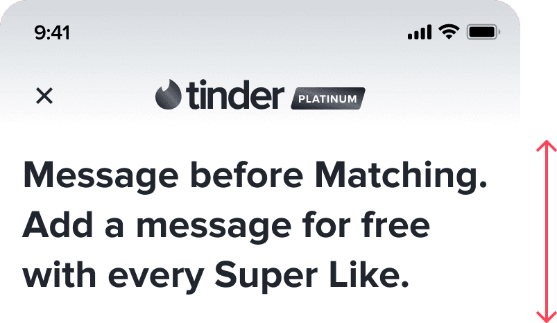
By providing transparent stats on successful Boosts, users will be more motivated to re-purchase.
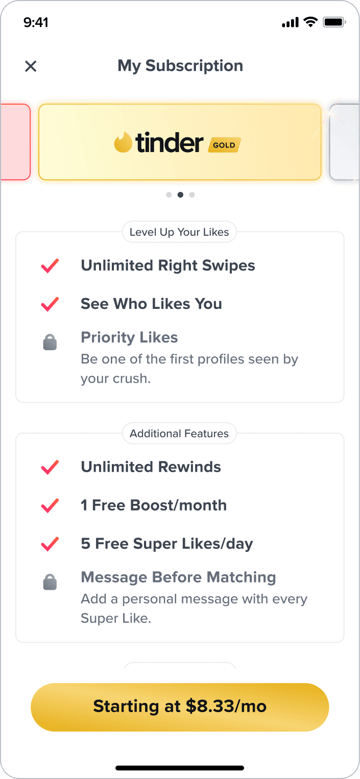
fig 01;entry points
↪ These screens make up the current Boost experience.
boost wallet
boost-again modal
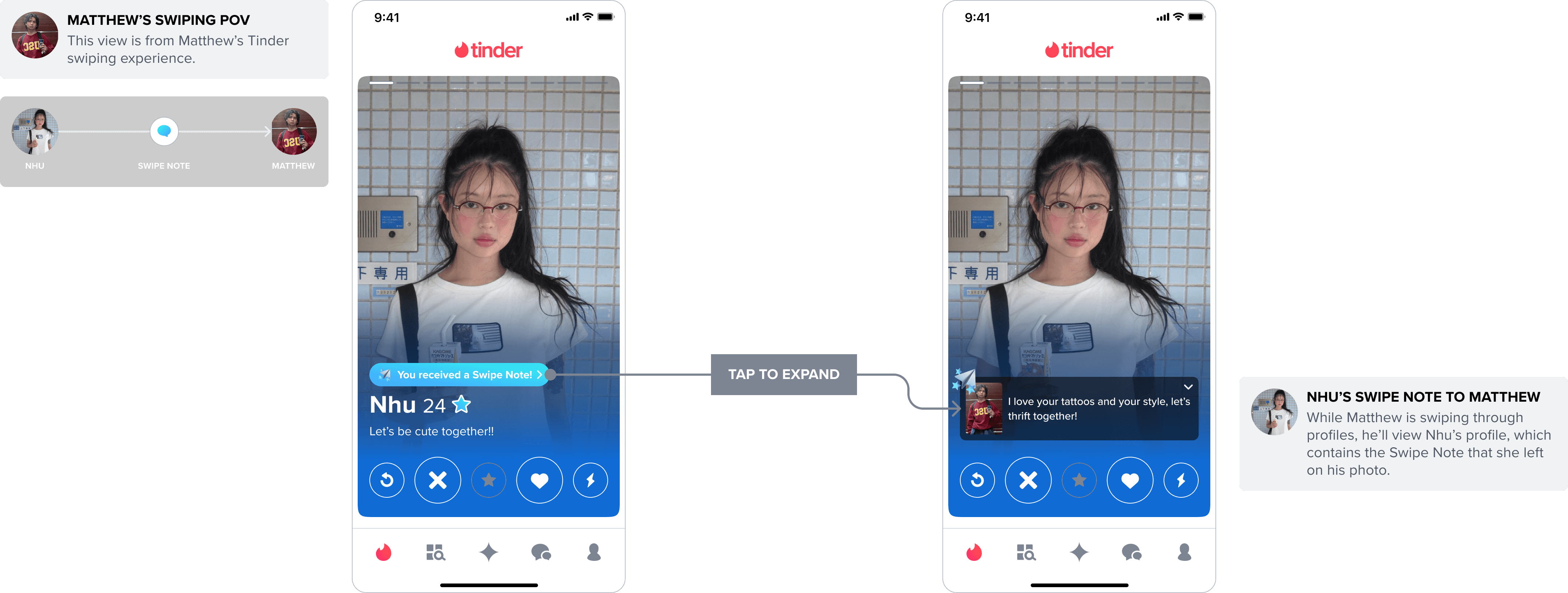
fig 02;why redesign swipe note?
↪ Because of a new reporting flow implemented by the Trust and Safety team for user-generated content within the app, we had to incorporate a new blocking/reporting entry point onto Swipe Note.
NEW reporting for user-generated content
in progress
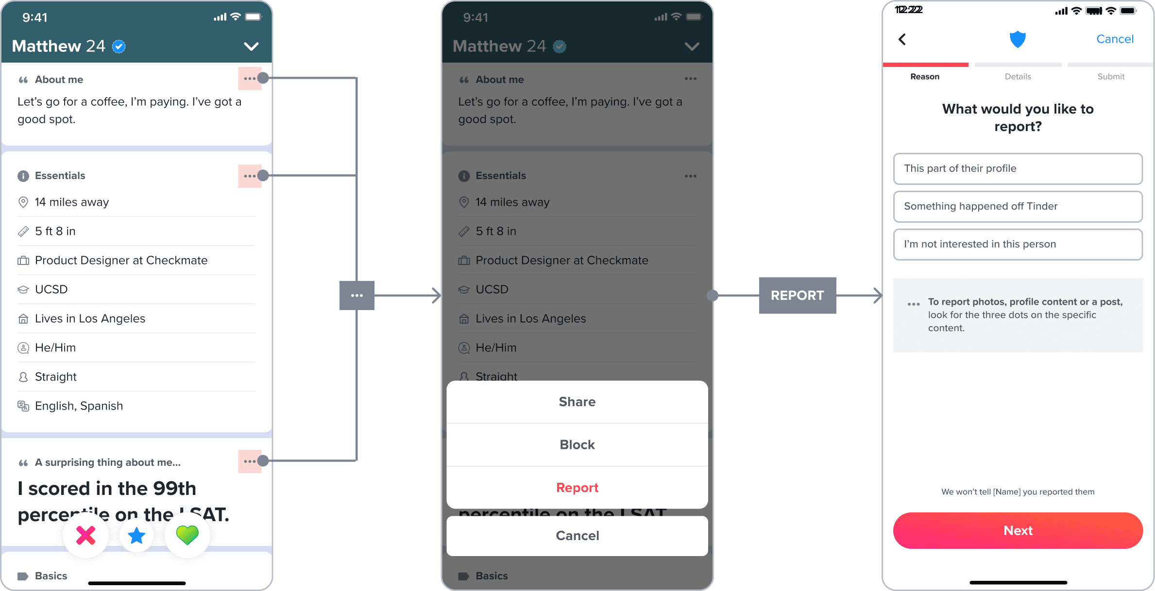
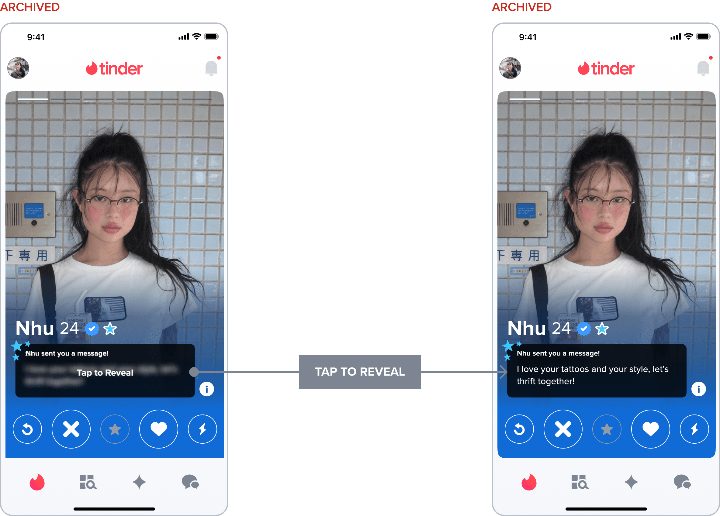
fig 03;swipe note v2
↪ We archived these Swipe Note designs during development to better align with a new profile visual design update that was concurrently being implemented across Tinder. We wanted to utilize the same format as these archived designs as they were also supported through user research findings and analytics.
Swipe Note V2
archived
research; swipe note v2
Swipe Note V2
archived
↳
Swipe Note V2
research
These were some key insights our team discovered from the earlier user testing and Swipe Note analytics studies of Swipe Note V2.
These findings led to the this new user flow
analytics findings
A
Many Swipe Notes were unflattering. Many users, particularly male, used Swipe Note as an opportunity to send offensive messages that were not specific to the photo the Swipe Note was attached to.
B
Swipe Notes are short. For Swipe Notes in English, the median length from female senders is 19 characters and the median length from male senders is 32 characters.
C
Female receivers read 62.7% of the Swipe Notes they received and male receivers read 51%.
carousel
↳
Version 1.0
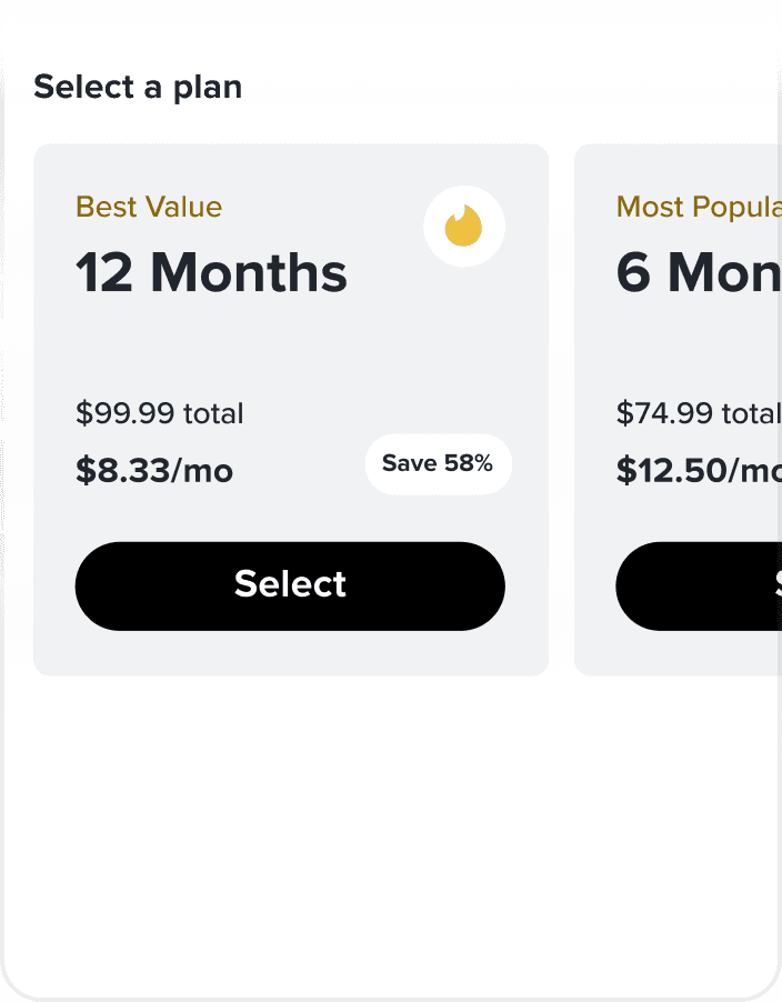
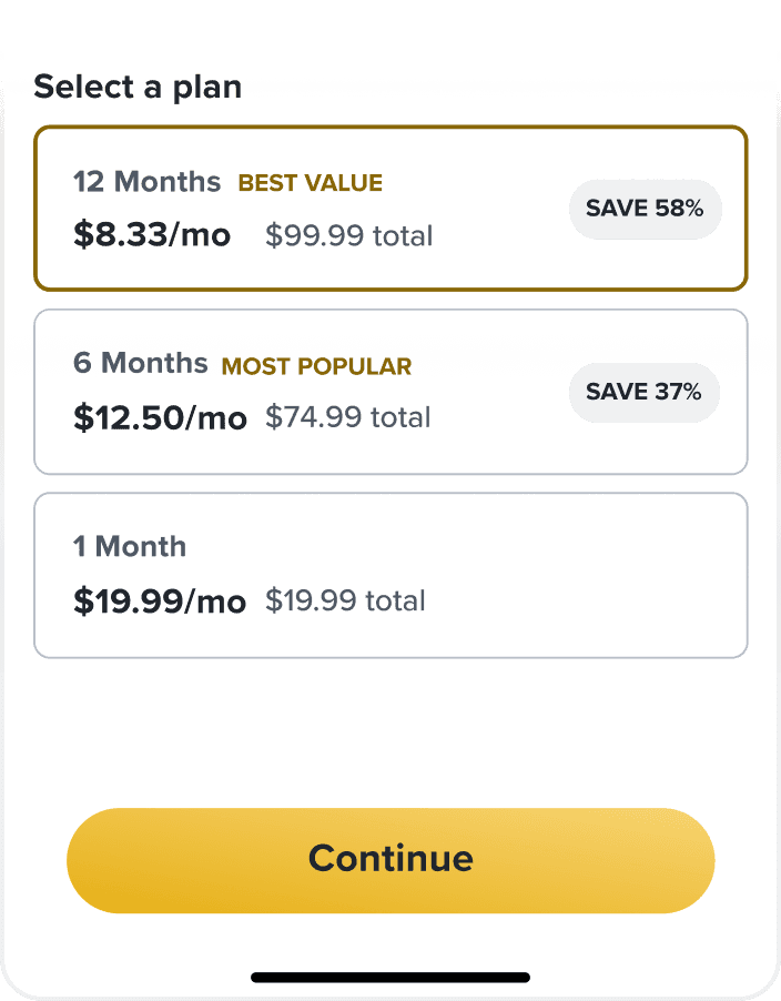
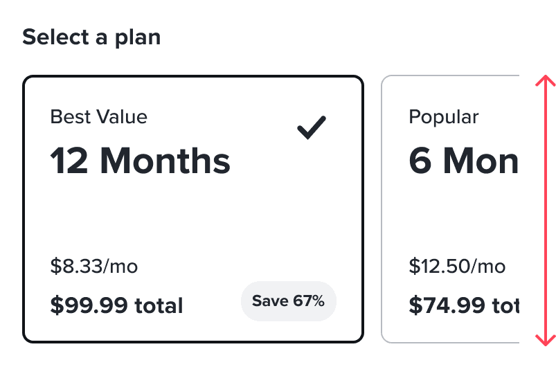
For the first milestone, we tested two layouts. The 3-SKU version has the same format as the current paywalls, while the carousel version introduces a new paywall layout.
3-SKU
3-SKU
-> No CTAs
-> Stacked SKUs
-> Aligns with current in-app paywalls
-> Upsells are always visible at the bottom
carousel
carousel
-> Clear CTAs
-> Focused SKUs
-> Flexible cards
-> More real estate for packages
Version 1
Version 1.5
↳
Version 1.5
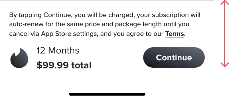
Carousel Layout Improvements For Version 1.5, we wanted to focus on increasing subscription cash in the carousel version, which meant improving the upsells.
A
Sticky Upsell By making the primary upsell sticky at the bottom, we hope to make the upsell more obvious and accessible to the user.
B
Deep Links We built in deep in deep links to other paywalls, thus removing the ‘paywall-within-a-paywall’ user experience.
research; milestone 2
↳
Milestone 2
research
For our final and most impactful milestone, we conducted 3 rounds of qualitative user testing to iteratively come to our final designs.
Round 1
-> Moderated Usability Test
+
Round 2
-> Unmoderated message comprehension test
+
Round 3
-> Unmoderated usability test
=
Milestone 2 final designs
↳
Milestone 2
research
testing round 1/3
For the first round of user testing, we wanted to compare the interactions of the carousel layout vs. the 3-SKU layout in the context of subscriptions.
original

*
With Tinder Gold being one of our most impactful and highest revenue drivers, we wanted to apply our learnings to the Gold paywall for all of our Milestone 2 tests.
testing prototypes
3-SKU
carousel
↳
Milestone 2
research
testing round 1/3 (results)
Overall, users didn’t communicate a preference between the two layouts, but majority needed more information about the subscription tiers in order to make a purchase.
A
3-SKU
->
Users liked being able to compare prices all in one screen.
->
Users preferred Tinder Platinum being displayed in an external paywall in order to keep the information separate.
B
carousel
->
The last card of the carousel was mistaken as a summary of all of the SKUs from the previous cards.
->
Swiping through each of the cards felt like high effort.
testing prototypes
A
3-SKU
B
carousel
↳
Milestone 2
research
testing round 2/3
For the second round, we decided to test our existing paywall to understand the interactions with the contextual entry point in the header, the header image, and the functionality of the subscription tier comparison page.
A
Contextual entry point
Users weren't able to make the distinction that they were getting the Tinder Gold subscription, and thought they were just getting the individual feature mentioned in the header.
B
Learn More screen
The paywall and the 'Learn More' screen were analyzed in isolation, and users weren't able to make the connection between what they were purchasing and the list of features.
A
3-SKU
testing prototype

testing prototype
existing layout
↳
Milestone 2
research
testing round 3/3
Cumulating all of our insights from experiment data and user testing results, we identified two new versions that we hypothesize will lead to a better performing paywall.
testing prototypes
list
carousel
↳
Milestone 2
research
testing round 3/3 results
paywall
sub merch page
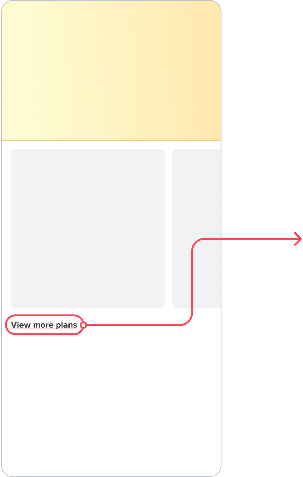
*
View more plans CTA No usability issues reported on the Sub Merch page, and all users were able to swipe between the offered plans. Overall, users enjoyed the addition of ‘View More Plans’.
carousel
list
*
Carousel vs. List Most users were successfully able to swipe or toggle between options, locate the purchasing CTA and ultimately make the purchase for both layouts.

*
Feature List 4/10 users expected the tiles to be clickable and wanted more information about the individual features upon clicking on the tile.

contextual header text
The feature in the header title changes depending on where the user encounters the paywall.

carousel layout
We chose the carousel layout for more flexibility for future iterations of subscription paywalls and adjusted sizing so users can compare the pricing of two SKUs at once.

sticky cta
The CTA is fixed at the bottom to encourage the user to scroll lower and view the full list of subscription features.


feature list
Since this feature list has the same information as the subscription comparison page, we kept the styles between the two aligned. The original design from the user testing was using a tile-like display of the features, which was misleading to users because the content seemed clickable.
dynamic sticky scroll CTA
To prevent the need for users to recall their selection at the top, the sticky CTA is dynamic while scrolling and changes depending on what package the user has selected. It also reflects the total price to reduce cognitive load.
final designs
fig 03; implementation
↪ Since this project, we've iterated on the dynamic paywall template to create 19+ new, unique paywalls that use the same components and styling. This demonstrates the impact as well as the scalability of the project, as every a-la-carte, subscription, and offer paywall has moved towards the dynamic paywall template. Since it's release, we continue to improve on the success of our paywalls as well as the alignment of the revenue experience across all features.

the future of paywalls
With Project Dynamic Paywalls, we can build a framework for future iterations of all in-app paywalls and define Tinder’s visual approach to revenue features.
↳
Componentized Paywall Elements
↳
Premium Branding
↳
Using componentized, reusable elements across our revenue paywalls increases alignment across designers and reduces workload for engineer implementation.
↳
Our updated paywalls aim to improve the premium user experience and visuals across the board to modernize the current Tinder revenue services in terms of usability and brand design.